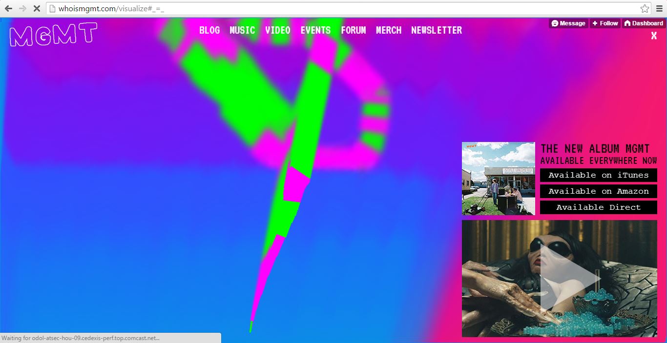
MGMT’s official website is a well-built website. I always like to go see what a band’s website looks like to find more information about them, and most of the time their websites seem pretty basic. Sometimes the websites do not provide the information I need, such as other links to their social media or a forum. Other times, bands’ websites have too much going on and it makes it difficult to navigate. I like MGMT’s website because it’s entertaining and it provides everything I need to know about them.
Another website that I think it’s well-designed is Tim Walker’s photography website. Whenever I discover a new photographer that inspires me I like to look them up online to see their portfolio and to contact them, but too often it’s only a Tumblr blog or the website does not provide the information that I want. I love Walker’s website because it’s simple, but it looks professional and it’s easy to navigate. Everything is well-organized and it’s easy to find things, such as his different types of photography, biography, contact information, and much more. I also like how the pictures are big enough to make the website more interesting. Had the pictures been smaller, I think the website would be a bit boring.
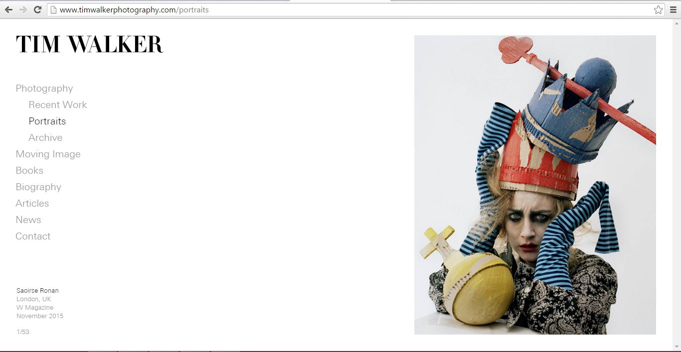
I enjoy MGMT’s because it displays their latest media, like a video and information about the music on the front page. Also the mouse movement animation on the page is trippy/interesting! Tim Walker’s site has some very interesting content and a clean layout that is easy to navigate with calls to action on the left and content on the right throughout.
I’ve never been to MGMT’s official website before… its awesome, thank you for showing me this! I love the colors they use, its like a virtual trip haha. With all this social media you could argue that those sites make it easier to keep up with your favorite artists, but I think visiting the bands official web page is much more intimate and says a lot more about an artist than say their facebook page.
Both of these websites rock. Thanks for introducing me to Tim Walker’s photography, by the way. Both websites are simple from first glance, but are very different when you interact with them. I did not expect that trippy cursor effect on MGMT’s website. Tim’s website was a no nonsense, clean photography site that really let the photos speak for themselves and that’s all I would expect from such a site. You made very interesting choices.