Two websites I find visually appealing are associated with two of my favorite things in life, food and music. The first one I wanna talk about is my what is in my opinion, the best ramen shop in Austin,Ramen Tatsu-Ya’s website.  When you first go to their website it takes you to a work of art (this picture is also painted on the side of their restaurant) instead of a home page and the only thing to click on a revolving circular object. Once you click on the object it takes you to their official home page. I warn you not to visit this website when you’re hungry, I say this because close ups of their mouthwatering ramen are staring right back at you. I also love the simple, yet artfully crated 5 page layout that gets straight to the good stuff with out making users click all over the place looking for what they want to know. The other website design I really dig is Sound Cloud’s site.
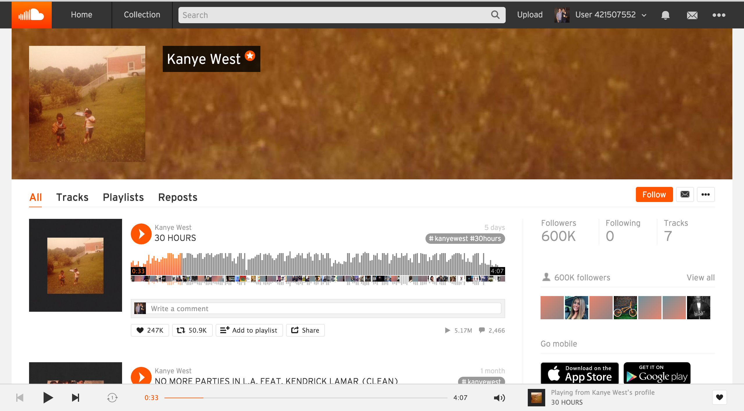
Again with this site I love the simplicity of it. Since I spend a lot of time on this site I want to easily find a song and add it to a playlist, and this site does a good job with button placement allowing me to do so. I also dig the logo and sound wave thing going on when you play a track. The minimalistic, black and white layout lets the logo and album art work pop so all you focus on is the music. These two websites right here make my eyes happy while I on the web.
The graphic art work, animations and scrolling options on the Ramen Tatsu-Ya website are amazing! It kind of feels like a comic book and seems like it’d be a very entertaining place to visit and eat. Also, Soundcloud is one of my favorite sites to listen to music simply because of its layout. The fact that you can see the sound wave and anticipate drops and peaks in the song are pretty cool and unique as well.
Soundcloud apart from Spotify is one of my favorite sites to use for music. It’s very simply from a layout aspect but it doesn’t need to be elaborate. The main function of the website is for you to listen to music and it does that. Improvements could be made to make it more pleasing to the eye but I don’t think that would attract more users or cause current users to abandon ship. The look of the sound waves make it seem like something you would see on an editing software which gives it a cool look.
Ramen Tatsu-Ya’s website reminds me of Austin—a little weird. However, as with the restaurant concept, this is a really unique website. Although, I really thought the imagery on the homepage was interesting, I had a hard time with navigation. Took me a moment to find the little red icon in upper left corner of the menu page. I like websites with simpler designs, this site was both simple and complicated—simple in design but complicated in concept. What’s kind of funny is that the food of this restaurant is simple in design but complicated in concept also. So the fact that the web design represents the restaurant well is this site’s best feature (in my opinion).