Websites with complex and innovative designs can often be interesting and fun, but hard to navigate. Personally I am not the most tech-savvy 20 year-old and simplicity suits me best. Two websites that I find well designed for the eye and for use are Amazon and YouTube.
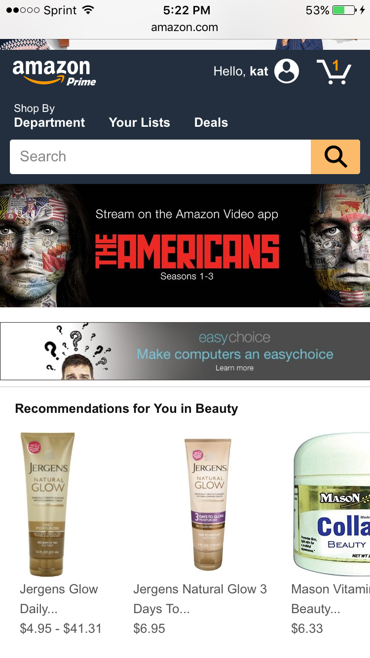
Amazon is a website that I visit on an almost daily basis. Unlike the average college female I hate going out to shop. When I first visit the site I notice the darker blue tones throughout the homepage. Similar to popular sites like Facebook and Twitter, Amazon uses this color to display a tone of authority and reliability. Establishing credibility is crucial for anyone looking to spend money on a site and Amazon does this quickly with is color scheme as well as the large, high quality pictures throughout the site.
Unlike Amazon YouTube is a video streaming site that must accommodate the millions of videos uploaded everyday. In order to make the site appealing to users the site does the opposite of Amazon and makes use of a lot of white space. If they had too much color the multiple scenes of each unique video would be caught in a blur. However, YouTube does use the bold and striking color of red in its logo that makes it memorable and popular.

Awesome post! I agree 100%; I am not the most tech-savvy person either, so simplicity is definitely bliss! I love everything about Amazon… maybe a little too much. I am always ordering things on Amazon prime. It is so easy, you are so right! I’m glad someone appreciated it just as much as I do. Also, YouTube is another thing that represents simplicity. I listen to a lot of music on YouTube and it definitely helps me with the random tutorials that it provides.
Good post.
Sincerely,
Ashley Marinez
I hadn’t really thought of the color choices of either of these sites. Definitely something to think about. Both sites are amazing and super easy to use. I think amazon has a great organization technique considering they literally sell anything you can think of. Youtube is also very organized and has a good search engine to sift through the millions of useless and strange videos that pop up there everyday.
I agree with your thoughts on Amazon, I know the color scheme of it but I never payed mind as to why they choose the colors that they did. I also like how the site has so many suggestions to relative things I’m looking up, the majority of time when I purchase something it was a suggested item. I think the simplicity of the site and the great prices keeps me a loyal customer!