Right now I am digging the Harris Media Website. I think is it well designed because it is cutting-edge. The background on the homepage isn’t a picture but video clips that have been put on a loop. It keeps the views attention for a longer period of time than a normal background would. I really enjoy the typography and layout used on the site. The typography attracts me because they mix it up with cursive and print and I enjoy that. The Layout of the site is like a blog, I think this is great for attracting young users . You can see the website here 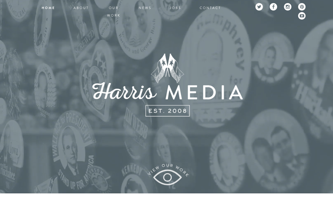
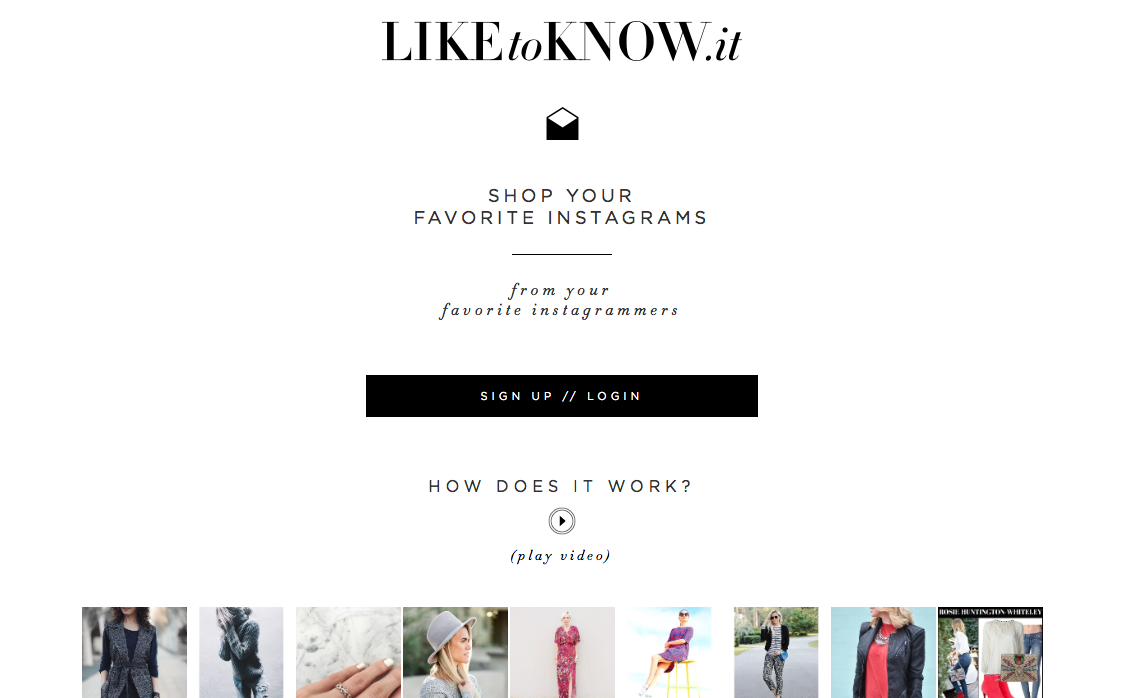
I really like the “like to know it” website because it is set up like a blog which no doubt is on purpose. This website is used to look at what your favorite fashion bloggers are wearing. I really enjoy the header and how “like to know it” is in both upper and lower case letters. Everything on this website is black and white except for the pictures. I like this because it looks clean and there are no distractions. This black and white with limited color technique draws the viewers eyes on the products in the pictures
.
I didn’t know about these two websites. I think the Harris Media website is awesome! The video clips that are running on the first part of the website is great and it really looks like what airbnb have done with their website. The colors and the font are pretty good too! This looks like a professional talented agency.
I also really like like to know it! I really like the layout. And the harris media looks cool as well! I’ve never heard of it, but I like how they mixed the fonts.
My favorite design elements on this site is the simplicity and color scheme. You wouldn’t think gray and white would be a pretty color scheme, but it a great combination on this site. I also thought the silent video slideshow was genius. However, I didn’t like the mixed fonts on the Harris Media typography in the middle of the home page. I prefer symmetry and consistency.
Oh my gosh, I’ve never seen either of these websites but they are both so pretty! I really enjoy the mixed fonts in the Harris Media logo and the mix of caps and lowercase in like to know it!
I couldn’t agree more with you, I really like how both websites look neat and professional. I specially like the “like to know it” website because it looks simple, yet it’s quite interesting!