 In the first article, Responsive Web Design, it mainly talks about the shifting landscape of web design. It says that mobile browsing is expected to surpass desktop browsing in the next three to five years. I honestly think that’s a good time table simply because we’re never on a desktop anymore. I mean really let’s think about how much more time we spend with our back hunched over looking at our phone screen or laptop than on a fixed-placed desktop monitor. I also like the idea of having a screen or monitor that changes its opaqueness depending on the way a viewer is positioned. Since we are in a heightened state of paranoia, security, and secrecy, it makes a lot of sense to have those options for everyone.
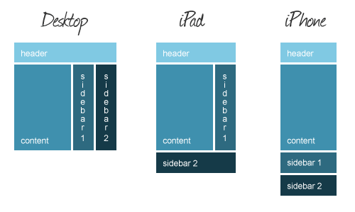 Honestly I feel like HTML and CSS are already pretty tricky to begin with. Adding media queries to the party isn’t as bad as it might seen! In the second article, Introduction to CSS Media Queries, I found out all it takes is a few extra lines of code and sometimes just a few things inserted into the existing code. Most of the codes replace elements such as width, height, float, and margins. Making sure that website is view-able across different platforms is key because we all have different ways of getting the information we want.
The last article, The Pros and Cons of Responsive Web Deb Design vs. Moblie Website vs. Native App, talks about how mobile optimization is becoming more and more important almost to the point of it being a necessity. I like the section that talks about the mobile website and the pros and cons that have to do with that. The pros are User experience, Speed, Cost, Benefit from local search, Immediately accessible. The cons are Multiple URLs, Maintenance, Not Universally Compatible. I agree with the local search because when you’re on google for example, and use your precise location and type in Starbucks, it’ll find you the closest one to you, which makes it easier for us so we don’t have to scroll down a long list of stores. I’m pretty sure that since they aren’t universally compatible it’s frustrating trying to look something up on your phone and having to scroll over because everything isn’t on the screen. Actually I know for a fact that can be a real pain in the a**.
I agree with the statement made in the first article about mobile browsing taking over the game. The only time I search for things on my laptop/desktop is if there are certain pictures of videos I’m looking for. The rest of the time I’m using mobile browsers to ask google to answer my immediate questions.
Hey Wynyard, It is cool how you can add just a few lines of text for a media querie and be able to make that much adjustments on top of html and css. I like all the pictures (you went above and beyond) and your descriptive summaries.
The cons in the article, The Pros and Cons of Responsive Web Deb Design vs. Moblie Website vs. Native App, seem to be outdated. What I learned in my article research is that by using “viewport breakpoints” instead of “content viewports,” most of the issues in the cons list can be avoided. Also, responsive web design is one of the ranking factors for Google SEO. From what else I’ve read about responsive design, it seems the only true solution to the different sizes of devices.
I definitely agree that trying to view a full website on a mobile device is such a pain! Trying to do Tracs on my phone is the most annoying thing ever.