In Alistapart.com, we learn from Ethan Marcotte’s personal experience the ways and reasons of why he believes responsive web design is important in the present. Marcotte questions how we will continue to adapt our designs to every device if there are so many. His answer is W3C’s media queries. Media queries allows you to maintain the format of your design depending on how big the device in which you are seeing it is on. The design can be changed when the device is smaller than a certain size. This allows you to format your design both in a normal desktop view, and also a little bit on smaller devices.
In htmlgoodies.com, Arpan Dhandhania also notes the importance of being able to use CSS code to adapt your design to different screen and device sizes. We are introduced to a more detailed and complex explanation of media queries. Some of the things we are told are important to take into account are the height and width of the device, height and width of the browser, screen resolution, and the orientation of the device. In order to adapt your website to certain device sizes, it is important to know this things. However, Dhandhania also notes that, “Media queries are meant for design presentation, not optimization.” As much as we want to adapt our designs, there are several complications that media queries don’t completely solve yet.
Designmodo.com shows several examples of Responsive web design, mobile websites, and Native apps. With this examples, and their advantages and disadvantages, you are able to decide more easily what path is the best to go when creating a website for smaller devices. I personally liked Responsive website since it is accessible in all devices. Mobile websites were my second option, but then you would have to maintain two websites. As someone that is just learning html, this does not sound appealing. I wouldn’t choose a native app as my solution mainly because updates have to be approved by the app store. You wouldn’t be able to write about something relevant one day, because by the time it is approved it might not be relevant anymore.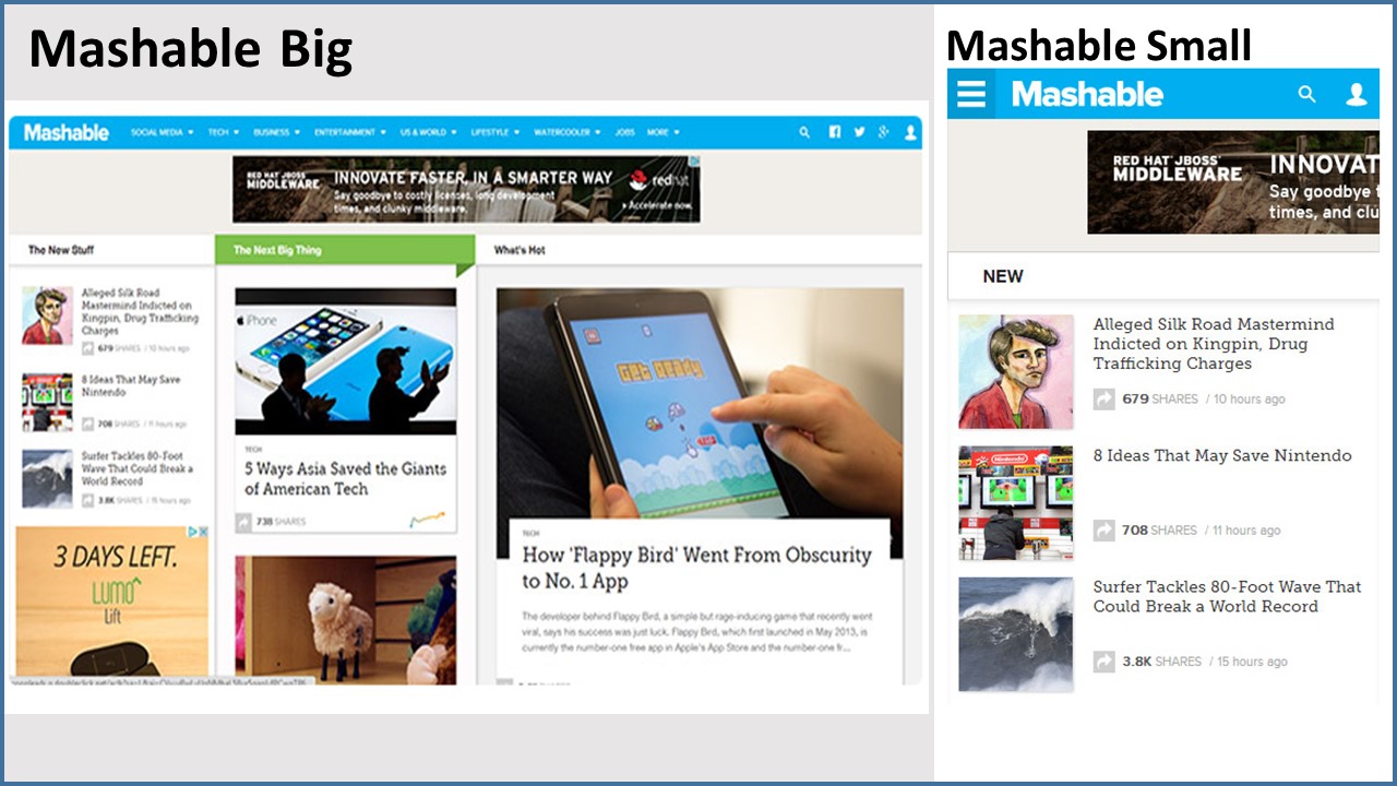
Today, technology is ever-changing. I liked how you said Marcotte answered his own question concerning adaptive designs. “His answer is W3C’s media queries”. These media queries are very important, because today there are so many different devices and I think we all know in a short period of time, there will be even more!