Responsive Designs For mobile sites.
This article talked about optimizing your website to fit mobile phones and tablets. That most people use their phones to go to websites because it’s covenant. That the mobile design should be different from your desktop because of the screen size. That the responsive design is supposed to be way different experience because of minimal optimization. It should also enhance the vertical sidebars, for when they flip their phones to the side and not just upward.
Adapting Media Queries for iPhone 6
This article talked about adjusting your query to your new apple iPhone 6s since the pixels are at 750 pixels wide instead of 375 pixels. Which mean it has 3x the pixels density when adding css properties. That way your images are higher quality. Then it goes to show the coding you need in order to adjust it. 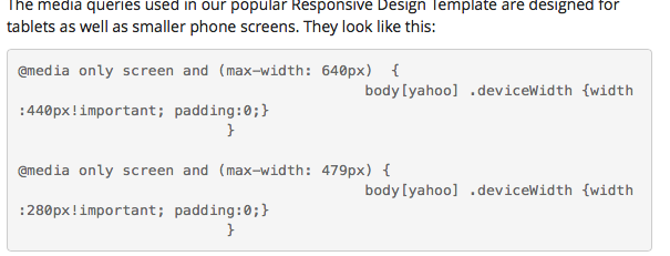
10 ways Responsive is Critical
This site give you 10 ways responsive design is critical to your website. Then it goes on to talk about how it promote consistency on your web page, and it’s less confusion. That it’s the best way to reach mobile user since everybody uses cell phones now. And it also enhance you offline experience by using HTML5 and only focus on things you want to see.