The Pros and Cons of Responsive Web Design vs. Mobile Website vs. Native App
I never considered the idea that you need to adapt a website to fit certain devices whether it be  mobile, desktop, game console, tablet, etc. I guess it’s sort of like watching a DVD and it says that the picture has been automatically reformatted to fit your screen. It’s not like I know what all goes into a DVD, but something tells me that formatting for different devices on the web may be a little more difficult. For the web you want to maintain a certain look and functionality while still making sure your audience is receiving the intended message. But then you are still faced with the problem of trying to get your site to format with pretty much anything without having to create ten thousand different sister sites. In this case you would be using a responsive web design as discussed in The Pros and Cons of Responsive Web Design vs. Mobile Website vs. Native App. Personally, I find that responsive web design is your best bet if you want to save yourself time, frustration, and money. On the downside you potentially face frustrating your users. I must say though, the Smashing Magazine’s small design looks pretty good to me.
Introduction to CSS Media Queries
Media queries are here to save the day (clearly). When I was reading the Pros and Cons article I was worried about how you would accomplish making a website that is ‘native’ to a desktop fit on a mobile device and still have the pictures fit the same. I was thinking that you would have to just go through a bunch of hoops and have multiple copies of the same pictures. I wasn’t too far 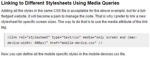 off, but with media query, it’s a lot simpler than what I thought in my head. I learned that you are able to keep the picture as is without overwriting it, which would unfortunately change the picture for whatever device it is displayed on. Fortunately you are now able to isolate it. I like to think of it like putting an alter ego in a box and taking it out whenever you are ready to use it. The box would be a separate CSS for the sites mobile personalities only. That probably makes no sense written down, but it makes sense in my head.
Responsive Web Design by Ethan Marcotte
Oh no! The horror! Not all browsers can support media queries. Why anyone is using anything 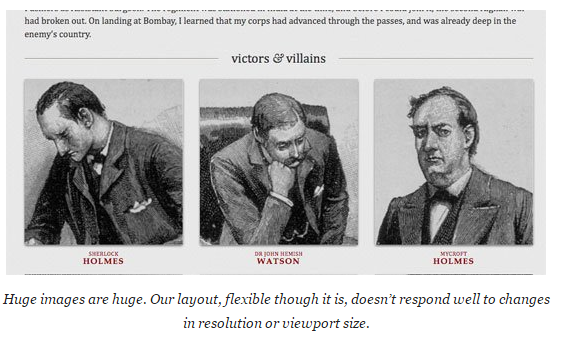 older than 2007 or IE is beyond me. Fortunately, for those that care enough, they can use a JavaScript plugin on their browser that will allow media query properties. Other than the talk of compatibility, this article discussed flexible foundation designs. In a nutshell it’s like using one of those retractable leashes; so you have control over constricting the layout and pictures whenever you feel is necessary. Unfortunately that leash can only go so far and you only have so much control over it. The flexible design works well for desktops and can’t really “optimize” with anything else. It’s like trying to put that leash on a fish.
I was also thinking that while reading the pros and cons article
Yeah, I vote Responsive too! It sounds more appealing to me mostly because I wouldn’t want to maintain two sites.