One of the sites that I frequent that I believe is well designed is surprisingly simple. Nerdigurumi is simple, but it serves it’s purpose which is why I believe it’s a good design. At first glance you are not overwhelmed with a bunch of things on the screen and you are greeted with this cute character. Typically a person who crochets will visit the site, so they know what they are getting themselves into. It helps that everything that may be important to the visitor is on the Home page. Sometimes crochet sites will hide their directory and just have a search bar as if we are supposed to know what to search for. That’s why I love this site. It is straight forward, and to the point, but at the same time it gives you a nudge in the direction you might want to go. Nothing more is needed. 
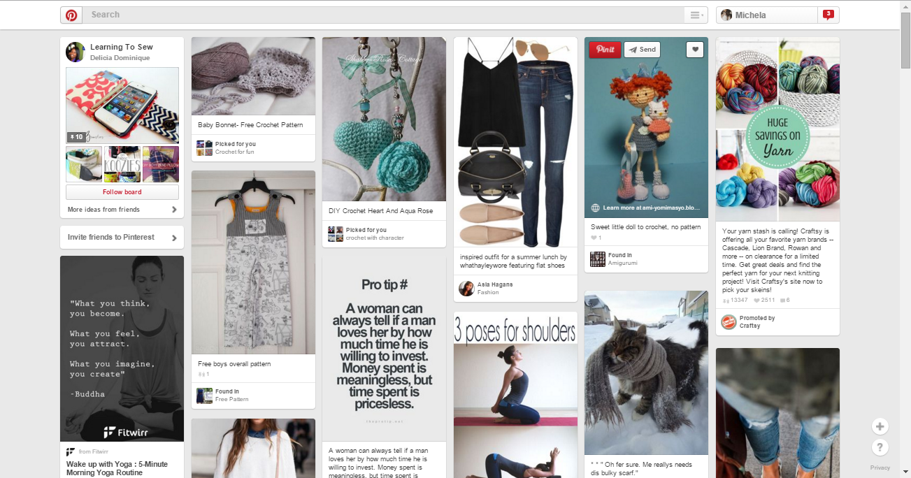
Another site that I believe is well designed is Pinterest. Admittedly, Pinterest does seem quite the opposite of what I like about Nerdigurumi because Pinterest is chaotic. I think the fact that it is so chaotic is what makes it a good design. The site is visually based, so you won’t see much text despite from descriptions on the photos which even so are small and gray so it doesn’t distract you. Only when the user is interested in the picture they see will they read the description at the bottom of the image. In addition, everything on the site is pretty much nothing but click bait, which will cause endless hours of searching for…what was it you were actually searching for again? Who cares? You went from looking at cute puppies to learning how to make a smore brownie! It is also brilliant in the fact that it knows what you are interested in. For example, I am interested in crochet, so my board is always flooded with crochet related pins as well as the pins of those who I follow.