Responsive Web Design
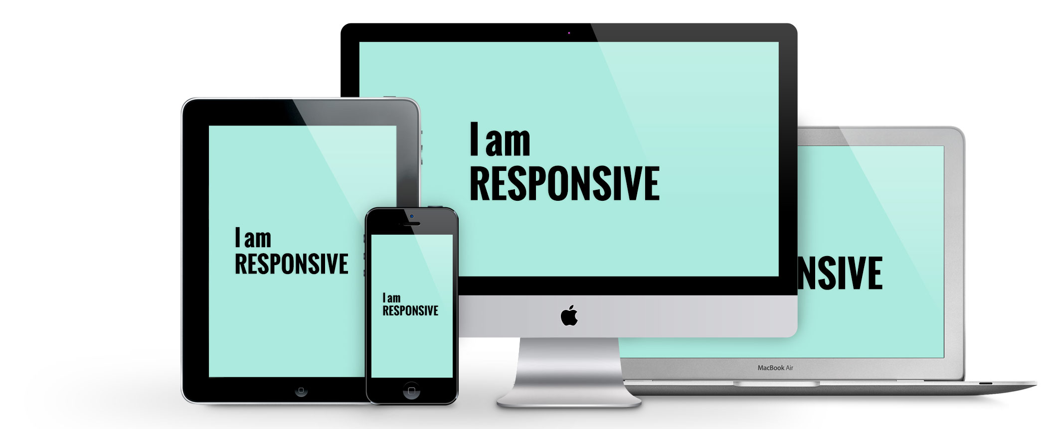
Responsive design is a concept that will be used more and more with the rise of electronic devices. With the vast amount of screen sizes and browsers, web designers will have to adapt and innovate their work in order for a web page to work on all platforms.
There are three different techniques discussed in this article that can make a webpage more responsive. These concepts are:
Fluid grid– allows the user to create responsive designs to fit dynamic screen sizes.
Fluid/Flexible images– allows users to add guidelines to images on their website so they can automatically adjust and fit them accordingly to different platforms and screen sizes. This is done by adding a query to the CSS style sheet.
Media queries– is a CSS3 module that allows a webpage to adapt its screen resolution to the various browsers and screen sizes.
Media Queries
Media query is also discussed in detail in the article Introduction to Media Queries. The article explains how slightly adjusting the CSS sheet makes an existing web page more responsive and compliant to mobile and tablet devices. It also explains that adding media queries has now become the norm, simply because of the wide range on screen sizes and resolutions. Though media queries will make the web page look the part, other components on the web site (like pictures) will still have to be optimized in order for the page to function correctly.
The Pros and Cons
The Pros and Cons of Responsive Web Design vs. Mobile Website vs. Natives App article explains the differences between having desktop and mobile websites. The article goes into detail explaining how having one website that adapts to both platforms can be easier to manage, but having a mobile and a desktop website can deliver an optimized response on a variety of electronic platforms.
Some of the Pros of having two different pages are:
- Better user experience while surfing the page
- The page will load quicker on various platforms
- Better search engine response for mobile websites.
The Cons are:
- Multiple pages means double the work
- Mobile website are still not universal to all devices
- Two URLs means more maintenance
With these articles I have learned that a web designer should practice and innovate their website to accommodate different screen resolution, screen sizes, browsers and devices.
I like how you clearly you defined several of the words from the articles. I also noticed in the third article that mobile websites aren’t quite universal yet, and therefore won’t always work. I’m sure in a few years that will change though. It definitely makes a difference.
Adrian, I found your post to be very informative. The subject-matter was broken down very nicely to make it more easily digestible. The way your post looks is very professional as well. I like how you listed the pros and cons of each choice involved in responsive design. Making them bold was a nice effect to have the text really stand out. I agree with your sentiment about how a learning web designer should be active in innovating their website. Different screen resolutions and browsers are certainly important factors to take into account.
I completely agree with the other comments. I like how you arranged your post and gave definitions since the articles had a lot of new words and phrases that made them hard to keep up with.