As the semester has progressed, we have started to become more familiar with HTML. There are different codes that do different things. With that being said, it seems like each new code that is learned, more complexity can be tacked onto it. These complexities are what start to give the website depth. It’s comparable to building a house. You must have the foundation and the structure. But no one would want to live there or visit if it was just the walls. Decorations and furniture that make the house a home are essential. The same applies to a website. Navigating the site easily and incorporating an aesthetically pleasing flow is what keeps people around.
We read three articles for class that were about creating responsive sites. Sites that can be accessible on different devices. This is essential to todays technological world, however to me it seems complicated.

The first article we read was about the basics of responsive web design. Like I previously stated, today’s world is transitioning to mobile devices. This is great, web design doesn’t have the limitations that printed pages do, but they don’t have the permanence. Codes need to constantly change in order to keep up with the advances of technology. Coding requires perfection, and in my mind, permanence should be perfect. These codes that make the jump smooth between devices could easily get tangled. Therefore there is the solution of W3C and media queries. This helps make the codes simpler. Being able to implement these codes into a style sheet makes being responsiveness manageable. This requires a different approach and way of thinking, just as it would when creating a home that is enjoyable for all different types of people.

The second article related to the first. It expanded on CSS Media Queries. This is helpful in coding because of the decline of complexity. It requires less work, just addition of a few extra lines of code. By doing this, the code can interpret which devices to adapt to. I compare this to the decorator of a home. They can see how things are going to look and what is going to work. The aesthetic of a site is crucial, that’s what the queries help with.
The third article was about the pros and cons of different types of responsive websites. Different examples vary between web design, mobile websites and apps. All of these must be able to adapt between devices. The question comes down to which medium is best. When I visit a site often, I prefer using an app. It has immediacy, it’s just automatically on my home screen and I am familiar with how it is navigated. I can also access it anywhere. But same with the other access points. I can trust that I can access any site from pretty much any device anywhere. But which sites work best with which medium? It all comes down to the circumstance. It is based on achieving certain goals, prices and features. Some websites might just flow better on an app opposed to a mobile site.
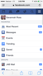
Take Facebook for example. The app is easier to navigate without having to reload after each click like the mobile site does. ![image[1]](http://webpub.jordonmbrown.com/wp-content/uploads/2015/10/image1.png)
It’s interesting how a simple set of code can have such an impact on how the website behaves and acts to different devices. Personally, I would still rather have a native app for my website then just a mobile website. Honestly, I just think it would be pretty neat to have an app on the app store (haha). Still, it’s good to know how media queries work as well as how to properly build a responsive website.