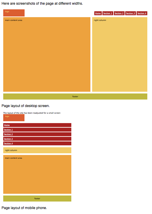
Responsive Web Design
Responsive Web Design is an article written by Ethan Marcotte about how people are able to adjust their websites to different sizes that suit different screens, such as a website that fits the screen of a desktop to a tablet to a mobile device. Instead of making different websites for the different devices viewers may be using, code is used on the design of the website. Responsive Web Design is a great way to adhere to viewers because it does not just make the website smaller on mobile devices but adjusts to what the viewer needs to see on the mobile device.
Introduction to CSS Media Queries
Introduction to CSS Media Queries is an article by Arpan Dhandhania discusses the different codes to put in CSS for websites and different device screens the websites will be viewed on. This simply means that people can use different blocks of code in CSS instead of creating multiple websites. There are different aspects that must be considered for the coding which are:
- height and width of the device
- height and width of the browser
- screen resolution
- orientation of the device (for mobile phones and tablets; portrait or landscape)
The Pros and Cons of Responsive Web Design vs. Mobile Website vs. Native App
The Pros and Cons of Responsive Web Design vs. Mobile Website vs. Native App is an article about exactly what the title says.
Here is a pros and cons list of having a single website:
The Pros:
- A single website. It’s easier to administer just one website for all devices.
- A single URL. This makes sure your users will find you on mobile devices without having to wait for redirects, especially helpful on slower connections.
- Easy SEO. There is no need to create specific content for mobile devices, while you still enjoy the benefits of your desktop website SEO on mobile devices.
- Easy marketing. No extra work for the marketing department is required to promote your website on mobile.
- Low cost. Simple math — one website is cheaper than two.
The Cons:
- A single website. Having just one website for all devices may be easy for you, but not always for your users. You will often need to put different emphasis on the same page in order to maximize conversions using the advantages of the platform.
- Technical. As responsive web design is a relatively new technology, there are still some outdated devices with old browsers that will load the website too slowly or even not fully.
- User Experience. Mobile is a completely different experience than desktop, so having a single, even responsive website, may harm your overall UX on both platforms. If you try to satisfy both mobile and desktop users with the same user interface, you may end up satisfying no one.
Here is a pros and cons list of having a mobile website as well as a single website:
The Pros:
- User experience. Congratulations! You have a website that is specifically optimized for mobile devices, considering all benefits and limitations of the platform, so you have a good ground to create a beautiful and usable UX.
- Speed. Your website will load fast and easily on mobile platforms.
- Cost. Building a mobile website is not a cheap option as compared to responsive web design, but still you can get a very reasonable price for the value.
- Benefit from local search. Search engines tend to provide good UX nearly as much as you do, so in local search results mobile optimized websites have better chances to rank.
- Immediately accessible. Though not an extra advantage over responsive websites, but it still plays its role compared to native apps, where users have to pass through download and installation processes.
The Cons:
- Multiple URLs. Your customer has to remember at least two URLs, or otherwise be redirected to the mobile website, which takes several seconds. The mobile website will need additional SEO work as well.
- Maintenance. You will have to maintain two websites.
- Not Universally Compatible. You have to consider that there are two different types of mobile devices: touchscreen and keyboard navigation. A single mobile website won’t look and work the same way across all device types.
Here is a pros and cons list of having a native app as well as a mobile website and a single website:
The Pros:
- User experience. Native apps can have better UX than any other mobile optimization solution.
- Accessibility and speed. Applications can operate even without internet connection making all your information available at any time. And if you are lucky enough to have an experienced and virtuous coder, your app will also load fast and smoothly!
- Everything you can imagine. Here’s where you can and should think out of the box and get creative. Mobile platform, especially with touch screen navigation, gives you mass of features to work with in order to provide excellent UX.
- Visibility. Once a user has installed your app on a mobile device, it stays there, showing up with its unique icon in apps menu.
The Cons:
- Not accessible on all devices. Your app is built only for a particular operating system and this means it will not operate on devices with different OS.
- Goodbye flexibility. All application updates will have to be submitted and approved by the app store every time, which can take up to a few weeks. Not every user will be happy with frequent updates and some will stay with the older version anyway.
- It’s quite costly. Native mobile app development is clearly the most expensive solution.
- Marketing and SEO. A completely different marketing strategy must be applied for your mobile app promotion and you may need help from a mobile marketing professional.
All in all, Responsive Web Design has made an extreme impact on how business websites are run. To me, there are many more pros than cons.