Responsive Web Design by Ethan Marcotte
This article focused on how you can take a website that is not responsive and make a few changes to make it more friendly on all devices. Marcotte says you can do this through flexible images and grids, and media queries. The first step is to change your images so that they are flexible with all screen sizes. You can do this by changing pixels to percents. You can also keep the resolution of a picture in good shape by setting a max and minimum width. Grids help maintain your spacing through the changes in screen size. Media queries are how you tell the CSS how to display you website on different screen sizes. You set a maximum pixel size for each design. Once that maximum is reached the CSS will change the website to look a different way for a different screen size.
Introduction to CSS Media Queries by Arpan Dhandhania
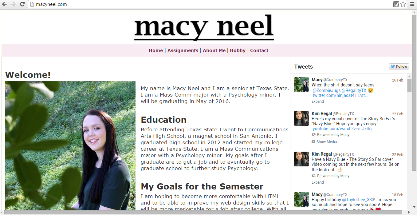
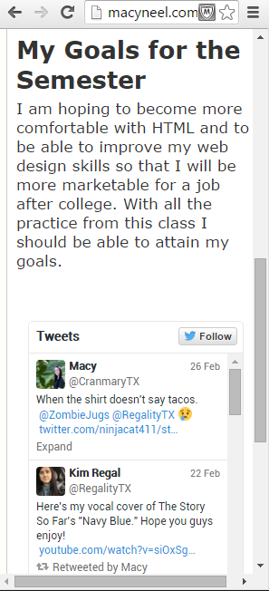
This article focused on teaching how to set up a media query and how those media queries change the look of a website for different screen sizes. It showed how changing the width, height, float, and margins in a page’s CSS can cause the page to be more responsive. For example, if a site has two sections on a desktop view, if a media query is included in the CSS, on the mobile view the sections will stack on each other vertically to keep the user from having to scroll over to view the whole site on a mobile device. On my site I have a twitter widget in my sidebar. On desktop view the twitter widget is to the right of my text, but in mobile view it drops to the bottom to keep mobile users from having to scroll to the right to see it. The article also gave advise on how to test media queries to make sure they are responsive on other devices. If you own other devises you can test them directly, but if not you can use ProtoFluid or Firebug.
The Pros and Cons of Responsive Web Design vs. Mobile Website vs. Native App by Armen Ghazarian
This article covered the Pros and Cons of each option that a web designer has to adapt to their website on mobile devices. In the end Responsive Design, having a separate mobile site, and having a native app all had pros and cons, but for my website responsive design is the easiest solution. Responsive design is the easiest to maintain and is a “one and done” solution to all different screen sizes. Responsive Design saves money and keeps the developer from having to maintain multiple website.
-Macy Neel
I love that you used your website as an example! We are learning so much in this class and you are showing us exactly what you did, I think that is awesome.