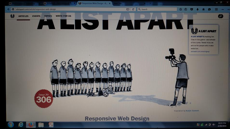
 A List Apart
http://alistapart.com/article/responsive-web-design
I found this article to be intriguing. It speaks of HTML as a foundation upon which a structure can be built. Utilizing responsive design provides the adaptability for a webpage. It is essentially molding a site with customization depending on the user’s interface. Since a mobile device has a different screen resolution than a typical computer screen, customization is necessary. I learned responsive design consists of fluid grids, flexible images and media queries. If a style sheet is the veneer of a building, responsive design would be considered the stairwell, elevator or wheelchair ramp. It is the accessibility for each patron to use through their own accord to gain entry. This article provided an excellent basis as an introduction to responsive design. The coding seems a little intricate with the percentages but trial and error along with a reference point, such as the provided lines of code would certainly help.
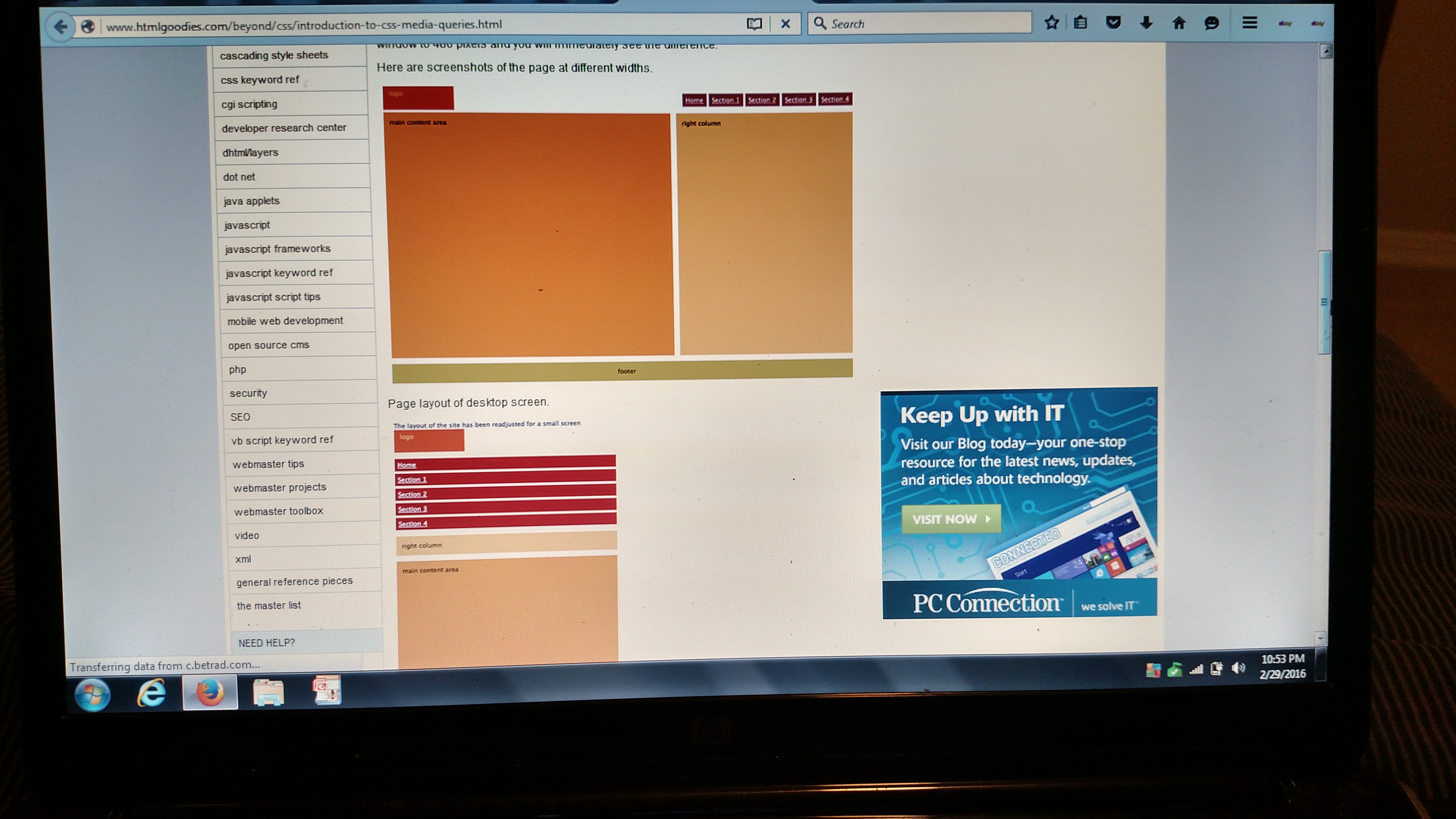
http://www.htmlgoodies.com/beyond/css/introduction-to-css-media-queries.html
Introduction to Media Queries
This article further elaborates on the idea of a site transitioning to determine the correct the resolution for a screen a visitor is viewing a website through. I learned this encompasses the height and width of the device and browser, screen resolution and orientation of the device. Not all browsers support media queries unfortunately. By setting a max width for certain resolutions in the CSS some mobile devices will adjust to fit the mobile device. Since different devices utilize different browsers and varied operating systems, a site like www.photofluid.com is extremely handy. You can test a site’s interface based upon if it’s for Android, iPad, iPhone or some other varied platform. Utilizing a website for each individual viewer is a great way to ensure a website won’t become lost in translation.
The Pros and Cons of Responsive Web Design VS. Mobile VS. Native App
The Pros and Cons of Responsive Web Design vs. Mobile Website vs. Native App
From this article I learned there are three mobile optimization options; responsive design, mobile website and native applications. The responsive web design involves making adjustments in the lines of code to adapt to a screen resolution. It makes sense to use this option as it is contained within a single website and URL, contains an easy Search Engine Optimization, easy marketing and low cost. The cons to this option are that it may be too technical for someone to program and you may need some outside help. Someone could consider making a site specific for mobile devices. There exists mobile devices with a wide variety of resolutions. You’ll garner a nice user experience, utilize quick load times, benefit from localized searches and things can become easily accessible. Maintenance for these sites can be a nuisance, such as having more than one URL. There is also no guarantee your mobile site will be universally compatible. Native apps are yet another choice, providing a decent user experience, quick load times, imploring a variety of creativity and excellent visibility. What hinders this choice is flexibility, cost, marketing and lack of access. There are many choices in the realm of responsive design. Based on all the pros and cons I’d choose a responsive web design with minor changes in the programming to adapt to the user’s navigation device. Doing research for the successful lines of code or paying someone to create it would result in complimenting a user’s overall unique experience, making it an invaluable investment in the long-run.