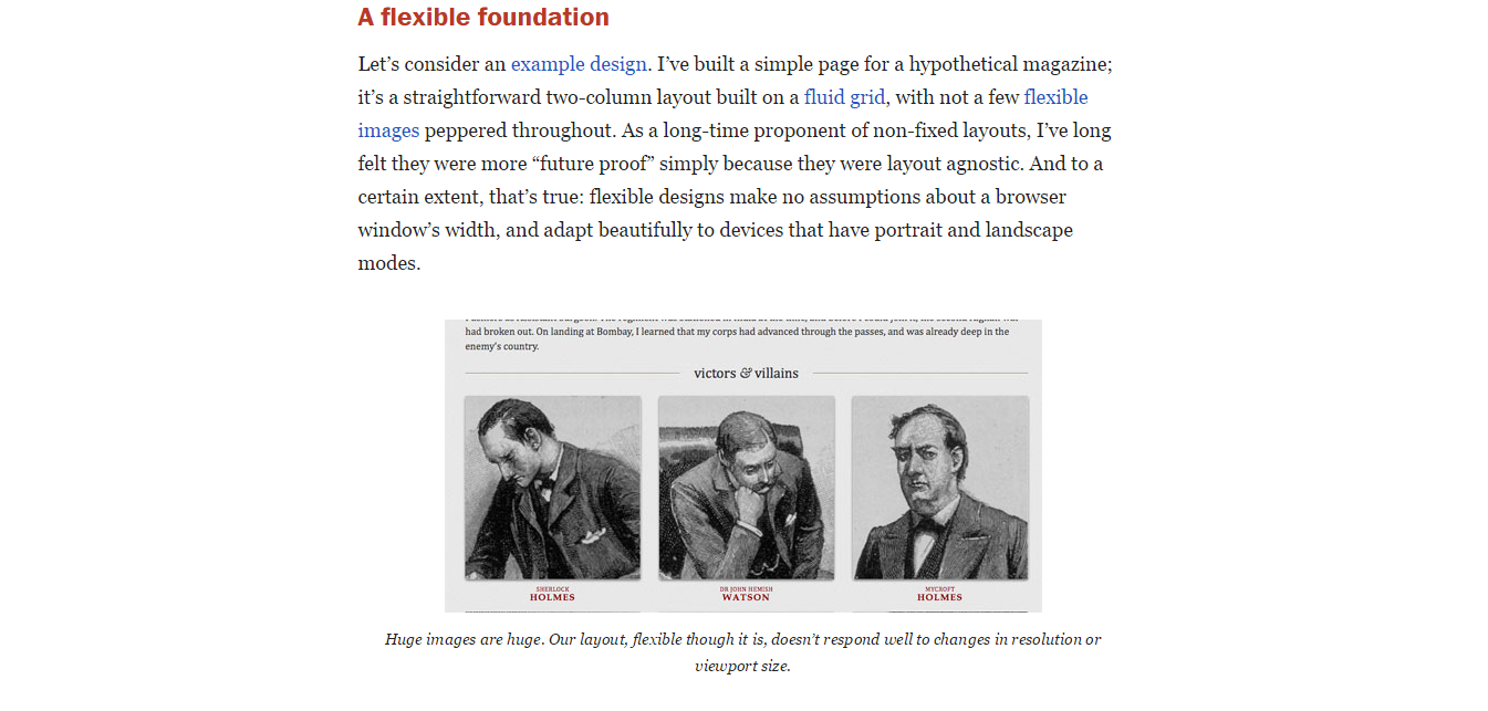
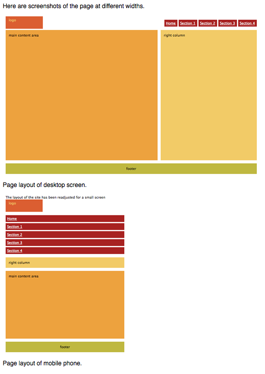
Responsive Web Design by Ethan Marcotte discusses how the web design world has been forced to deal with designing for mobile devices, such as smartphones or tablets. Web designers must keep up with how quickly technology is progressing by learning how to design web pages for mobile devices. To build a responsive website, a designer should use a flexible foundation that “make no assumptions about a browser window’s width, and adapt beautifully to devices that have portrait and landscape modes.”
Introduction to CSS Media Queries by Arpan Dhandhania discusses the different varieties of CSS available to suit the needs of different types of media. According to Dhandhania, there are “different blocks of CSS code for different screen and device sizes” which allows web designers to manage one CSS page that will be responsive on any size device. This relieves designers of being forced to create a new code and site for every size device.
The Pros and Cons of Responsive Web Design vs. Mobile Website vs. Native App is an article written by Armen Ghazarian. There are a few different ways to optimize a website for mobile view: responsive web design, mobile website, or a native app. Each one has positive and negative aspects. A business should analyze their situation and how they want to dive into mobile optimization before selecting one of the three options.
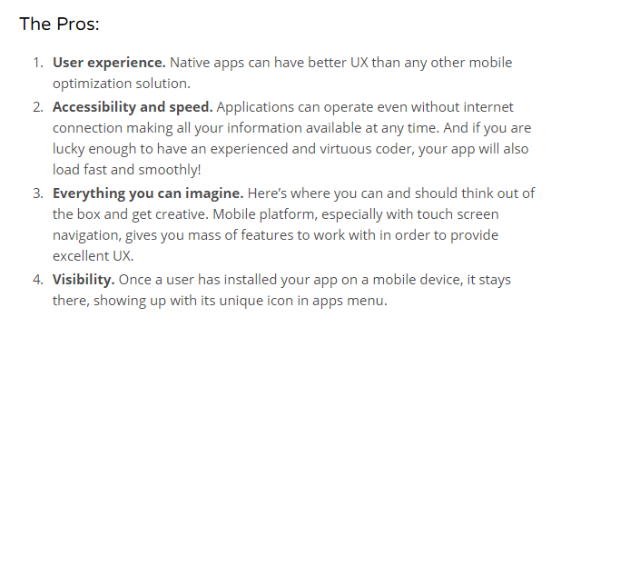
My personal favorite is the native app. A native app is ” a software specifically developed for mobile devices.” Native apps have to be downloaded onto a mobile device before being used. While the native app is costly and not always accessible on every device, I think it is a great tool for branding and bring the attention specifically to a business. I would love to some day design an app.
Larisa Gawlik