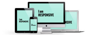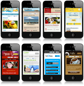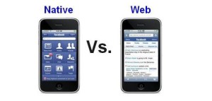
There are many methods for designing a website. With advances in technology there are multiple devices used to browse the web. In a 2014 article for DesignModo, Armen Ghazarian explained Responsive Web Design, Mobile Websites and the Native App. In the article The Pros and Cons of Responsive Web Design vs. Mobile Websites vs. Native App, Ghazarian breaks down each method as follows:
Responsive Web Design
Pros:

- 1) single website
- 2) single URL
- 3) easy SEO
- 4) easy marketing
- 5) low cost
Cons:
- 1) single website
- 2) technical
- 3) user experience
Mobile Website
Pros:

- 1) user experience
- 2) speed
- 3) cost
- 4) benefit from local search
- 5) immediately accessible
Cons:
- 1) multiple URLs
- 2) maintenance
- 3) not universally compatible
Native App
Pros:

- 1) user experience
- 2) accessibility and speed
- 3) everything you can imagine
- 4) visibility
Cons:
- 1) not accessible on all devices
- 2) no flexibility
- 3) costly
- 4) marketing and SEO
In his article, Ghazarian goes on to discuss the differences between the three options. It sounds as if the best option is now the Responsive Web Design since it is able to be compatible with most all devices.
In keeping with the Responsive Web Design, Ethan Marcotte published an article for AListApart in 2010. In his article Responsive Web Design, Marcotte accurately predicted that mobile browsing would dominate over console-based browsing by 2015. In his article he explains that due to this circumstance, Responsive Web Design is the most accurate design method for a website. Though no one could predict the numerous different mobile devices now used to access the web, it is now clear that console-based browsing will never control the majority of accessibility again.
In continuing with methods of coding a website to work on multiple devices, Arpan Dhandhania wrote and article for htmlgoodies.com entitled Introduction to CSS Media Queries. In the article, he explains how due to the use of multiple mobile devices from tablets to phones, Media Queries are a powerful tool when styling a website. He lists four specific capabilities of interest:
- height and width of the device
- height and width of the browser
- screen resolution
- orientation of the device (for mobile phones and tablets: portrait or landscape)
While Dhandhania goes on to say Media Queries are helpful in a world where multiple devices are used for browsing and queries can make an existing site mobile and tablet compliant, he insists that queries are meant for design presentation not optimization. Meaning when creating a new website, you do not build it for a desktop then retro-fit for compatibility.
I like the layout of your blog and agree with what you have to say about Responsive Design and Media Queries. This is a great idea about listing out the pros and cons of each platform to choose from when deciding on a mobile website. I also made a list of pros and cons!
The way you listed the pros and cos makes it much easier to understand!
Oh! Your blog post is well organized. kudos. I liked how you neatly organized the pros and cons of each.