Article 1: Responsive Web Design
In his article “Responsive Web Design,” Ethan Marcotte gives an introduction on the importance of flexibility in media design. While reading this article I discovered how vital it is in this digital age to be able to maneuver different types of electronic devices. He emphasizes the multitude of mediums that coders and companies are having to adjust to. According to Marcotte “mobile browsing is expected to outpace desktop-based access” within the next coming years. He also goes on to specify what changes have had to be made on things like screen size, margins, and so on to fit the visual needs of today’s users.
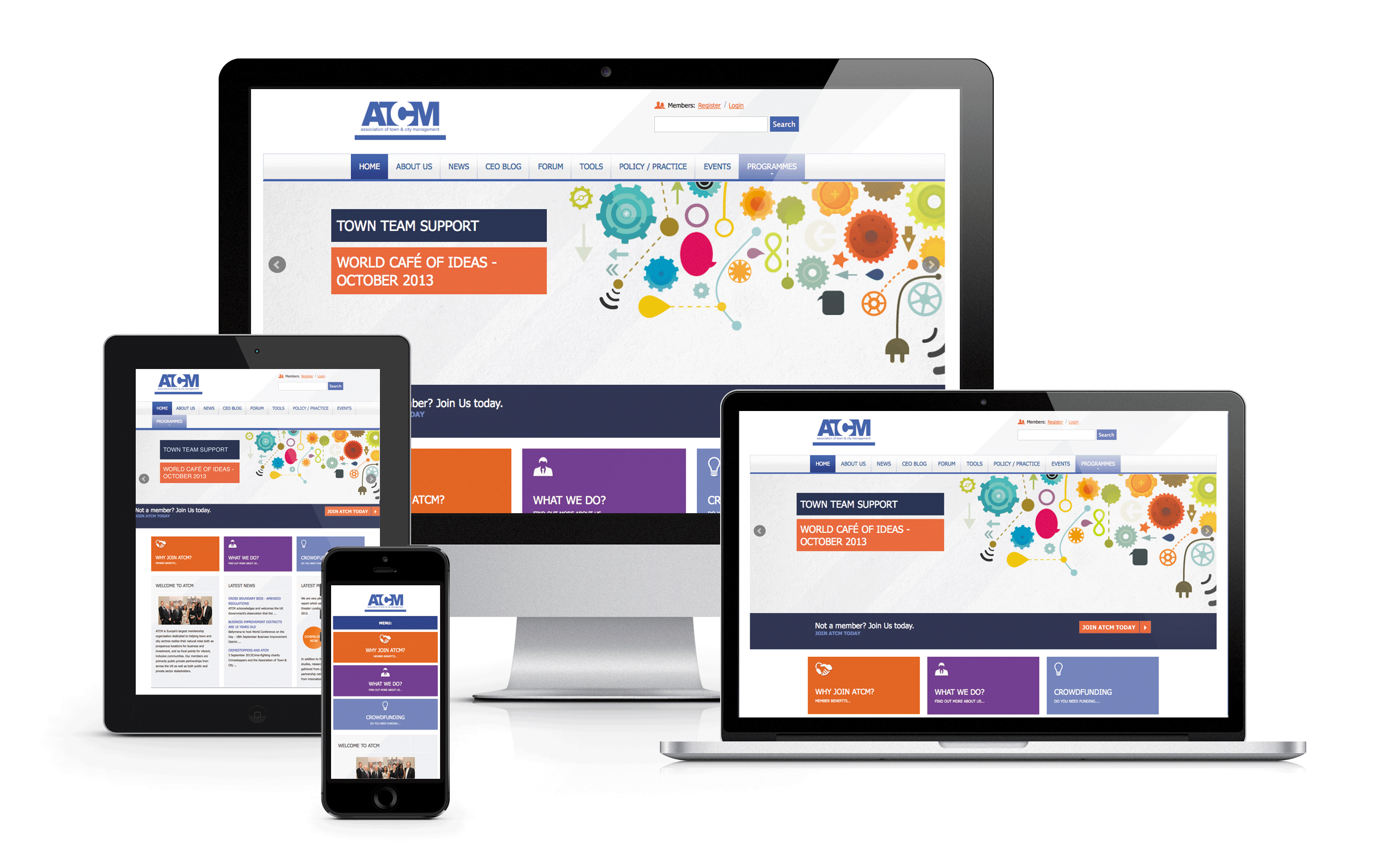
Article 2: Introduction to CSS Media Queries
In his article “Introduction to CSS Media Queries,” Arpan Dhandhania emphasizes the important aspects changes made in the coding process to optimize for different screen sizes. I learned how big changes in the visuals I see between mobile, tablet, and desktop can be made by simple lines in CSS and html. Many coders used to and still do create separate styles sheets for different devices. Dhandhania shows that although that still works it doesn’t need to be done in the new CSS3 platform. The media queries he goes over provide a simple technique for users to quickly and efficiently navigate between devices and provide the consumer with a visually appealing design.
Article 3: The Pros & Cons of Responsive Web Design vs. Mobile Website vs. Native App
In the article by Armen Ghazarian he details the three ways to optimize a website for mobile design. The three methods he goes over is responsive design, mobile website, and native design. As in the other two articles he shows how doing responsive design for a site would be easiest because of the single design, however I also learned that SEO can be effected by a designers choice in mobile optimization. Responsive design optimizes SEO through its singularity and also provides a low cost option. Although it is easier for the designer and company to use responsive design it may not be the best experience for the user. Ghazarian shows how designing a mobile site separately can make the experience for the user much easier and often keeps them using the content longer. Finally, he goes over native content and its ability to be accessed without internet connection. This is important for many different applications that do not need to load content immediately to the web such as a photo editor. Unfortunately he adds that many of these applications are inaccessible to users on devices other than mobile.