This article was interesting in the fact that it had lots of great information on how you can use what you already have to give everyone a better website to view. You do not always need a second website or a mobile application, but you can make adjustments to your current website to optimize it to be viewed on any platform through hypertext markup language (HTML) that you will embed in your cascading style sheet (CSS).
It is all about “becoming responsive” and knowing what type of device that you will have someone view your website on so you can make the proper adjustments in code so things will become easier to view. You will need to adjust your media type and the device width more than anything because those will give you the biggest adjustments because the width of an iPad is much smaller than a desktop screen so the pixels need to be adjusted.
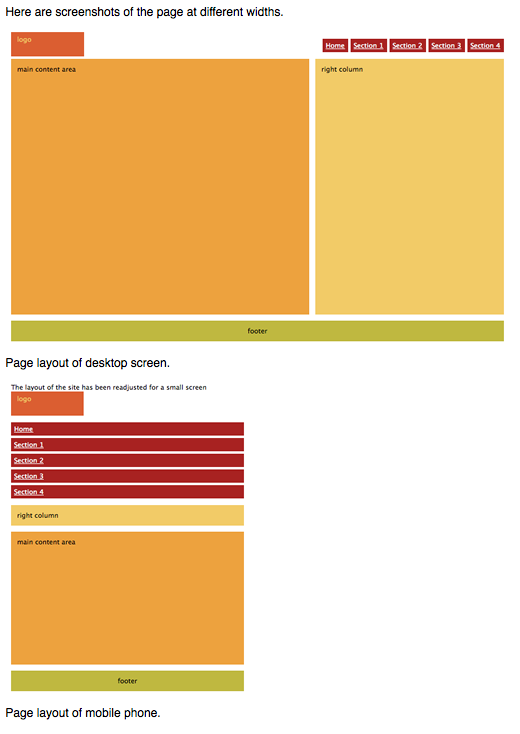
The article itself pinpointed images on a fictitious website that was created with images and how it looks on a mobile device without the codes being adjusted then compared it to what the mobile device looked like after adjustments had been made to columns and image sizes. With making minor changes to code, the website was made to respond to the device in which it was being viewed without having to build a separate website for a mobile device which will save you lots of money.
Introduction to CSS Media Queries
My first take on media queries was apprehensive. Because I was thinking that in order for me to make sure my website or any website is formatted for smaller screens, such as an iPhone, iPad or any tablet for that matter would require a whole new CSS. I was wrong. You can actually just add more code to your already built and perfected CSS that you use for desktop and laptop view.
A huge sigh of relief came over me when I read this. If you do not know how to write HTML, just thinking you would have to create a CSS for each device to be viewed on would take lots of time and unnecessary headaches, well at least for me it would. But this give you the capability to change the width, height. logo, photos and margins to fit an iPhone so those individuals that view your website on their mobile device can enjoy the site because it was designed for it and not have to constantly scroll left or right to read or view something they want to see.
If I had to constantly adjust my screen in order to read an article or view photos that took more time and effort that I wanted to give, I would just close the site on my phone and move on to something else. I don’t want to put forth extra effort and neither does anyone else. Everyone expects things to be pretty much perfect from the start and we all want to grab our related information as quickly as possible and this is a good way to do it.
The Pros & Cons of Responsive Wed Design vs. Mobile Website vs. Native App
When I thought about all the options listed above I wasn’t too sure which option would be most beneficial to me. As I thought about it some more, I realized that it would all come down to one question for me, what make more business sense to me and my business. Now, if I was a small business with very little money to create a separate mobile website or native app, using a responsive website through CSS media queries would be my best option because I would only have to manage one website and my customers will only have to remember one URL. The one downside for me with this option is, there is only one single website. Today consumers expect companies to have multiple websites or a downloadable app for your smartphone or tablet but that isn’t always an option for companies.
A native app is an awesome option if you have the means to have this created and optimized for your smart devices. We all have them on our devices. Who doesn’t have Facebook, Instagram, Pinterest, Google, or even Paypal downloaded. All of those are native apps and they were created specifically for your operating system and it does come with a price tag, but this is a great option to give your customers the opportunity to have any and all information you want them to have at the touch of a button. This is great because they will always have access to you, even without an internet connection and they are built for the operating system you are using. This gives consumers a faster response time when navigating within the app itself which is overall a better experience you will give the consumer.
A mobile website is another option. This does mean you will not just have one website, but you will have two and will need to maintain both of them equally. The mobile website is just designed specifically for a mobile device. The biggest thing that you should look into when creating this is speed. It needs to be able to navigate within the site quickly and without issues. Personally if I am on a mobile website and it takes longer than 2 – 3 seconds to load a page, I close it and move onto another site. I know if I do this, then so do countless other people. But in the end you will be able to give your consumer a more specific user experience that you want them to have since the site will be optimized for their specific device.