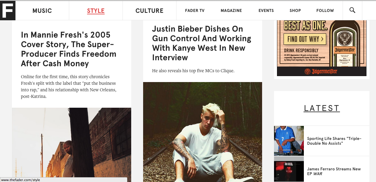
I enjoy the looks of both theses sites. The layout for fader is easy on the eyes. I really like the layout of the 3 large tabs for Music, Style, and Culture. The site also gives smaller tabs such as events, Fader TV, and shopping which is still something the reader may want to view, but the top news stories are what they want to get out. The layout is not to plain but, it’s not flashy and i like that. The use of a whites, black and red give it a sleek look.
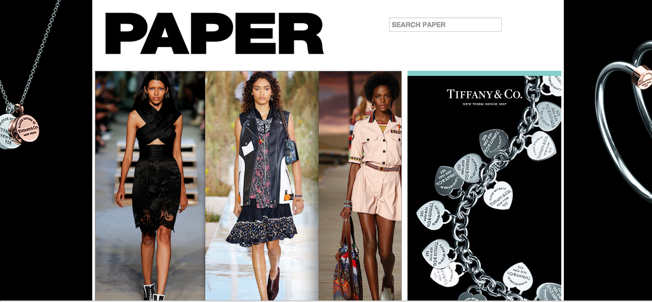
Paper magazine differs from fader just a tad bit. The reason I like Paper Mag is because it reminds of a some sort of blog. It catches your eyes with its unbalanced and unsymmetrical look. This can be tough for many because of the clutter, but theres so much going on in pop culture that it just fits for me. The page has a bunch of articles laid out in different shapes and sizes. As opposed to fader whose layout seems symmetrical. Both of these layouts are enjoyable.
I’d never heard of The Fader, but after perusing it a bit I agree with you. It isn’t too flashy and the use of black, white and grey give it a sleek look and it really is easy to navigate.
The Fader is the ish.
Such a great place for content. The site is designed very simple but also very visually appealing because of that simplicity.
Using lots of color is not where they want the reader’s eyes to focus on. They want that focus to be the stories.