I view numerous webpages each day, whether on a desktop or mobile device, and I can’t say that I’ve ever looked at one purely for it’s aesthetic design. Until now.
To keep up in the ever-changing world of journalism, I view a variety of magazine content via the web, and my eyes have been opened.  The look of a online mag’s website definitely makes me more inclined to peruse the sight. i-D Magazine, a fashion specific leg of Vice LLC, gives a feeling of chic style in the form of an online news source.
i-D Mag, and many other sites, has decided to go with a more visual home page. A large picture of Elle Fanning sprawls across the top of the mobile and desktop sites. The site uses strictly sans serif font consistently, and I noticed they don’t capitalize any letters in headlines – I think to keep consistent with the lowercase “i” in i-D. The desktop version of the site features the same style navigation bar with tabs that link to all parts of the site; the mobile version navigates from a drop-down style menu in the upper-left. The greyscale color palette, that is signature of Vice, is used in combination with pink-colored links to articles. Stylish.
In an entirely separate lane of internet content, C|net is a website made up of reviews on products ranging from cars to camera lenses to refrigerators. They have also adopted large visuals on their home page, but they organize them in panels to display the top reviews for the day. Right under the panels is a navigation bar that makes it easy to find reviews you’re looking for. The red navigation bar and orange-colored links is signature C|net.Top-left, next to their logo, they have a search bar that gives suggestions based on reviews that are hot. It can get text heavy on certain pages because the reviews are extensive, but many of them are supplemented with images and sometimes a video review is done for highly anticipated products. C|net must be largely driven by ad revenue, as you can tell by the massive “LIMITLESS” ad that is basically the background for the homepage. 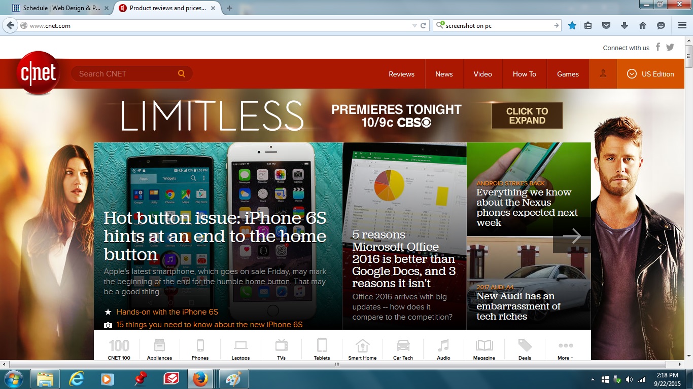
I really enjoy websites that focus more on visuals and media rather than tons of text. It makes for a more legible and easy to look at website. I really like the design of the two websites you chose. They both utilize their respective space in a way that engages the user and allows for easy navigation. Great picks!
I love C-net. I always consult them before I make an electronics purchase. Their troubleshooting is typically very good as well, and site navigation is effortless.
I really enjoy the way I-d was designed. It’s super clean and I love the way that the images help the flow of its minimalistic style. Also I noticed it was an endless scrolling page, which is something I like a lot. Much better than having a page directory in my opinion.