Responsive Web Design
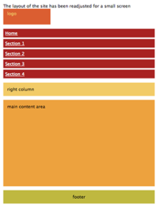
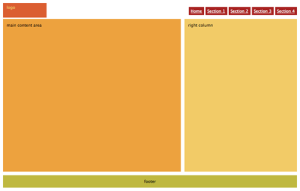
In this article, written by Ethan Marcotte, I learned several things about responsive web design. I also learned how fast the landscape is shifting for media browsing. Taken from the article, “Mobile browsing is expected to outpace desktop-based access within three to five years.” There are now a greater number of devices in which you can access the internet on, different methods of input, and more browser choices than there’s ever been before. Marcotte does a great job in relating a building’s foundation (architecture) to that of a websites- it is basically the same concept, with different aspects. With responsive architecture, the question of how “physical spaces can respond to the presence of people passing through them” can be answered. By using responsive architecture, the website would then be optimized and made more user friendly. This can be accomplished through responsive web design. The article then proceeds to cover the basics of how responsive web design works and the coding that goes with it. For more information about this article, you can read it by clicking on the following: Responsive Web Design.
Introduction to CSS Media Queries
In this article, written by Arpan Dhandhania, I learned about the expansion of CSS and how it has grown and continues to evolve throughout the years. From CSS, to CSS2, to now CSS3; new elements are being included in the way things are done in the Cascading Style Sheet’s type of way. “Media Queries” being added to CSS3, targeting specific screen sizes can now be achieved. With this new tool, designers can now create different styles for different screens… say a desktop computer compared to an iPad. Media queries are merely an “assisting” tool to help a designer out. The article ends it with a good statement that says, “Today, when building a new website, many developers build it for the desktop screen and then use media queries to retro-fit it for the mobile and tablet. While this will work, its not the optimal way to do it. Media queries are meant for design presentation, not optimization.” For more on media queries, visit this link: http://www.htmlgoodies.com/beyond/css/introduction-to-css-media-queries.html.


The Pros and Cons of Responsive Web Design vs. Mobile Website vs. Native App
In this article, written by Armen Ghazarian, a businessman can answer the question “What is the best way for your business to go mobile?” As you can see from the title, the article assesses the pro’s and con’s of the following three methods, which are used to answer the question “Which of the following mobile optimization methods is the best for your particular business?” You have: 1. Responsive Web Design, 2. Mobile Website, 3. Native App. I will now list a few pro’s and con’s from all three to summarize the article. For Responsive Web Design- the Pro’s: 1. It is a single website. 2. It is a single URL. 3. It is easy marketing. Cons: 1. That it is a single website. 2. It is technical. 3. User experience. For Mobile Website the Pro’s: 1. Speed 2. Cost 3. Immediately Accessible. Cons: 1. Multiple URLs. 2. Maintenance. 3. Not Universally compatible. Native App the Pro’s: 1. Everything you can imagine. 2. Visibility. 3. User Experience. Con’s: Not accessible on all devices. 2. Costly. 3. Not flexible. If you would like more in depth details, visit this article at: http://designmodo.com/responsive-design-vs-mobile-website-vs-app/.