“Using Responsive Images (Now),” touches on the responsiveness of images. We’ve all been there… we visit a site that has pixelated images that are hard on the eyes. This article explains how to make images responsive. One of the topics it focuses on is device-pixel ratio. With the scrset element, you can essentially list different image tags and depending on the browser, one of those images will be appropriately selected for optimum display. Essentially, we have crafted the responsive website, but not yet the responsive image. Right now as it stands, only Chrome and Opera browsers support the picture and srcset element.
The rate of technology is growing at a rapid speed, and the article “Thinking Responsively: A Framework for Future Learning, explains why it is important to optimize responsive site now to create a simpler and easier approach in the future. The key is to focus on the needs of the viewer – the consumer. Instead of relying on a set of code, it is essential to look at it from a viewers standpoint. I find this article interesting because the people creating responsive sites are focusing on the human aspect – something that tends to get overlooked when dealing with technology. Companies are spending more time getting to know the actual people who use their services, therefore creating a more user-friendly site.
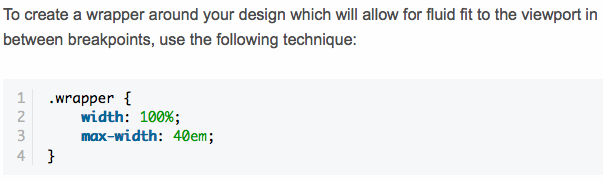
In the article “A ‘Readability First’ Approach to Media Queries and Layout,” it talks about using % and em/rem units. The reason being because % creates more fluidity in width between breakpoints, making the site more responsive. The article essentially talks about the importance of readability and how it goes hand-in-hand with design to create a more responsive site.